The Major League Baseball season has just recently entered its stretch of the summer days at ballparks across the country — the time of year when hot dogs are really hot, the beer and sodas are cold, and taking in a good, old-fashioned baseball game is where it’s at.
The players have strutted into the hottest days of the year looking pretty hot themselves. Well, at least from the neck down — sometimes tobacco chewing and seed spitting aren’t so flattering to some fans. But at least some new uniforms that the “boys of summer” are sporting will definitely turn some heads. Out of all the 13 current teams who have these special “City Connect” get-ups, some of the looks don’t even use the team’s traditional color scheme and are purely “cut from a different cloth,” pun intended.
These are the 10 best “City Connect” MLB uniforms that you’ll see on the diamonds all across the league, in no particular order. And try to keep in mind that even if you’re not a fan of the city, the uniforms stand on their own.
Colorado Rockies
The uniforms that the Rockies are wearing seem to “connect” the most with the characteristics specific to their stomping grounds, or let’s say mountains to be exact. Across the chest are those majestic mountains — though not as purple as the song “America the Beautiful” says, don’t worry, you’ll find them on the matching hat. Rather they are green, which is a nod to the pine trees found in Colorado.
The color scheme runs right into the pants, making this outfit a big contrast from the black, purple, and silver palette you’ll usually find the team wearing. The hat features the state’s abbreviation, circled by yellow, red, a little more green, and those mountains. Lastly, the font on the jerseys is taken from Colorado’s license plates.
Houston Astros
Known for having perhaps the most colorful uniforms in baseball, at least in a throwback sense, the Astros design here takes that classic navy blue, yellow, and orange scheme and weaves them all together for something very special from head to toe. Sporting a font design that looks NASA-approved, all they’re missing are astronaut helmets.
Adding to the uniqueness of the outfit is the “Space City” lettering across the chest, in reference to Houston’s historic background in American space exploration. And the Texas state flag is added to the sleeve, on top of a grid-like design that makes the jersey seem like it has state-of-the-art technology. Finishing up the outfit are pants that have piping featuring a fade of the Astros’ orange to yellow and back, same as the socks.
Chicago White Sox
The Chicago White Sox, who ironically don’t incorporate actual white socks in any of their uniform designs, still haven’t done so here. But, that doesn’t matter when you check out this look that was actually unveiled last season. The design pays homage to Chicago’s Southside across the chest. It’s designed in a gothic font that’s unique to their standard black and white outfits, also taken from the city’s traditional Greystone architectural style.
The numbering naturally matches, and their traditional pinstripes play contrast to the all-black base fabric in both the jersey and the pants. In fact, the black fabric has a distinct two-tone that isn’t quite as striking as a camo print. All in all, the jersey looks cool enough to wear as a casual top for those who aren’t even close to playing the sport professionally.
San Francisco Giants
The Giants have a unique design that pays tribute to not just one of California’s, but one of the country’s most recognizable landmarks, the Golden Gate Bridge. With an all-white fabric base, this uniform is decked out in plenty of orange. The Giants stylized ‘G’ is placed on the front, along with their customary font for the names and numbers on the back of the jersey. But both sleeves are wrapped in a print of the bridge.
What makes this one stand out more than others, is each design facet featuring what at first appears to be a faded gradient but is really a purposeful detail of the customary San Francisco fog. These are designed to look like the nearby landscape that sits around the bridges. It’s all topped off, literally, by orange hats that keep the standard “SF” script but show off a bridge on the side.
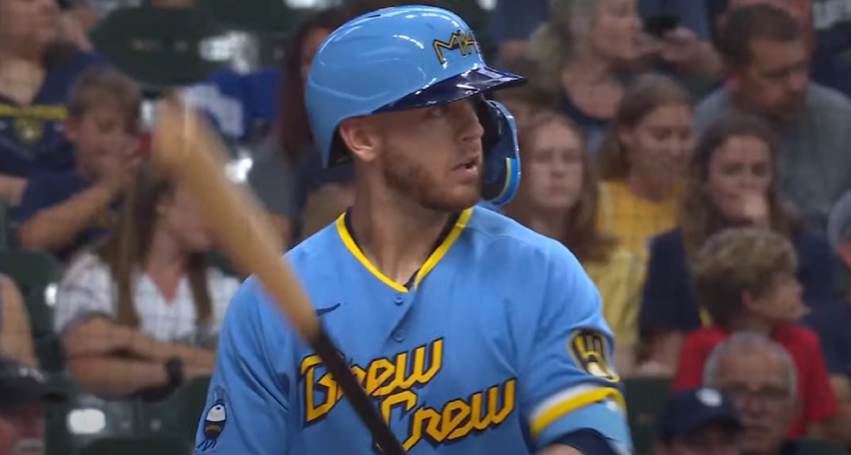
Milwaukee Brewers
The Brewers got clever in drawing a couple of details from things that perhaps only citizens of Milwaukee would fully recognize. Starting at the top, the cap features an “MKE” script that’s actually the airport code of Milwaukee’s Mitchell International Airport. But if you look closely, there’s also a “414” hidden within the design, a nod to the city’s area code. The overall color scheme is inspired by both the vintage Brewers uniforms and also the People’s Flag of Milwaukee.
In a bold fashion statement, the jersey sports a patch of a grill that resembles a baseball, referencing the area’s strong grilling culture. And the team claims that the sleeve piping goes a step further in looking like a freshly poured beer, foam head and all. Across the front is the team’s very popular nickname, “Brew Crew,” to make it all truly Milwaukee.
Washington Nationals
Similar to what the Rockies have done, the Nationals went away from their team’s standard palette of red, white, and blue. Instead, they opted for a gray jersey and matching hat that features a font characteristic of the local architecture. And an added touch not normally found on baseball fields, traditional D.C. cherry blossoms are featured all over in both the fabric print and accenting the lettering.
With all that plant life comes a considerable amount of pink but it’s done so well in the design that you can’t do anything but appreciate it. One sleeve has the team’s logo patch in the aforementioned unique colors and the other arm features the Washington D.C. flag. The pants are made from a cream-colored fabric that matches the lettering and numbering of the overall uniform design.
Kansas City Royals
This Royals uniform was put together with a design that drew from so many details involving Kansas City’s extensive baseball history. Old clubs and even the Negro League Monarchs are represented in this design. The navy blue jersey fabric covers each team while the striping on the sleeves is a direct nod to the Royals’ uniforms from the 1980s.
The logo, found on both the jersey and the hat, is inspired by the city’s prominent water fountains, including the one in their home ballpark. Another interesting feature is something you’ll never see while the players are wearing it but it’s worth talking about: music legend Paul McCartney once created a victory song for the team that included a chant of “HEY – HEY – HEY – HEY,” which is stitched inside the jersey’s collar.
Miami Marlins
The uniform for the Marlins actually pays respect not specifically to the city of Miami but rather its strong Cuban heritage. Instead of the exotic Miami blue, “Caliente red,” and black, this outfit boasts a red, pinstriped jersey that’s modeled after the Sugar Kings, a Cuban minor league team that once operated under the Cincinnati Reds. It was first unveiled last season, as part of their celebration of Cuban Independence Day in May. The logo on both the bright blue hat and the right jersey sleeve does identify the Marlins but is designed similar to the original Sugar Kings logo. Even the original team name can be found stitched just above the jersey tag.
Arizona Diamondbacks
Over its 25 seasons, the Diamondbacks have worn a number of different uniforms, each pretty characteristic of the Arizona environment. This new one is no different, made of gold fabric, meant to resemble the local Sonoran Desert and Hispanic culture. Not deviating from their already unique set of team colors, one design was obviously different from the usual outfits. The name “Serpientes,” which translates directly to “Snakes,” is scripted across the chest.
Other details include the front numbering and back nameplate in their usual red color, for a cool contrast in colors. Their team logo is in black on the jersey’s left sleeve while the right sleeve features the Arizona state flag. There is also another logo referencing Phoenix’s nickname as the “Valley of the Sun” found near the jersey tag. The hats are also gold with the Diamondbacks logo and the pants complete the head-to-toe luster in the same color.
Boston Red Sox
This one is likely to be the most against the grain of all these uniforms. For a team that has worn their standard blue and red for well over a century, this uniform sports a powder blue shade and yellow — yes, yellow for the first time in the club’s history. Why? The Boston Marathon and Patriots’ Day are just as woven into the city’s history as the Red Sox themselves, so the team wanted to pay homage to them.
To be frank, what’s likely the most obvious is the yellow jersey, but anyone who’s seen the Boston Marathon, or at least the end of it, knows how bright yellow the finish line is. This one is as far out of the box as a David Ortiz home run. The front lettering and the back numbering don’t match and the left sleeve features a patch that’s styled like a marathon bib, an item from a completely separate sport. It contains a ‘617,’ in reference to Boston’s area code. There’s no red anywhere! But through it all, it speaks directly to the city of Boston.


Published: Jun 27, 2022 03:41 pm