The long wait is over and the long-awaited Starfield is finally here (for those who pre-ordered the Premium edition. anyway). The interstellar RPG is one of the most hyped games of the modern era, promising to iterate on the gigantic open worlds of its forbears Skyrim and Fallout 4, but with an entire galaxy to explore.
But, sadly, it seems gamers with disabilities aren’t invited along for the ride. Accessibility advocate Steve Saylor regularly reviews big releases to evaluate how playable they are, as well as consulting with developers on how to improve their options. Now he’s played Starfield and doesn’t hold back.
“A huge mess”
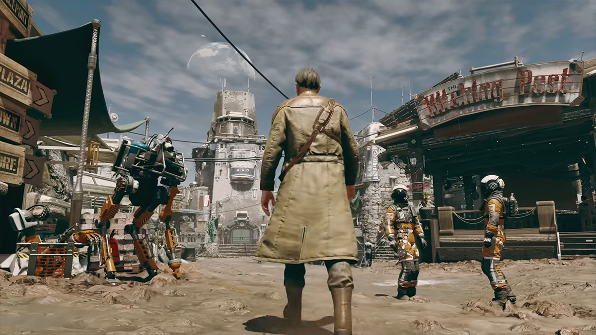
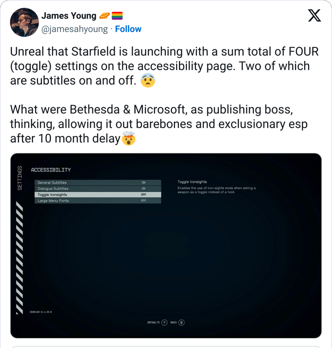
His verdict on Starfield? Not good. The Accessibility menu is limited to five options: a toggle for subtitles, a toggle for dialogue subtitles, two types of item rotation, deciding whether to use iron sights when aiming a weapon, and larger menu fonts.
The addition of larger font sizes for menus is singled out for praise (likely as much for people playing on televisions as for those with limited vision), though there’s no further customization for font type, color, or setting a flat background color for improved readability. There are also no optional gameplay modifiers (for example, slowing down time when you aim) to aid those with reflex issues.
Saylor identifies readability issues like the text for the spaceship HUD being blue, with the space background also often the same shade of blue. Another issue is font contrast against menus, making text “extremely hard to see, even with big font mode enabled”. In a darkly amusing twist, Saylor notes the game does feature a high contrast mode that highlights enemies, animals and interactable options, but it only works when you’re using the in-game scanning tool.
Also lacking are visual cues for sounds during gameplay (i.e. if you’re being shot at from behind). But his “biggest gripe with the game” is the in-game navigational maps, which are entirely useless whether you have limited sight or not.
Saylor summarizes:
“If folks were hoping space would be accessible, it is not. I wish I could say that this was going to be the first accessible hit from Bethesda. It is not. Sadly, not even close.”
Those views are echoed on social media by many unhappy gamers:


Is Microsoft breaking its promises?
All this is especially disappointing because Microsoft has celebrated its own efforts to improve accessibility. They’ve released the ‘Adaptive Controller’ “designed to meet the needs of gamers with limited mobility” and the company has a Gaming and Disability team focused on Xbox products who say:
“We have dedicated our careers to the pursuit of making gaming accessible and joyful for all.”
This team runs the ‘Xbox Accessibility Insider League’ that takes feedback from the public to be passed on to developers. Their efforts have resulted in improvements to multiple titles, as well as accessibility feature tags being made visible on the Microsoft Store so players are aware of options before purchase and consultations on Microsoft’s biggest games to get them up to scratch.
Starfield was delayed twice during development, so why wasn’t the Gaming and Disability team consulted during that period in the lead-up to release?
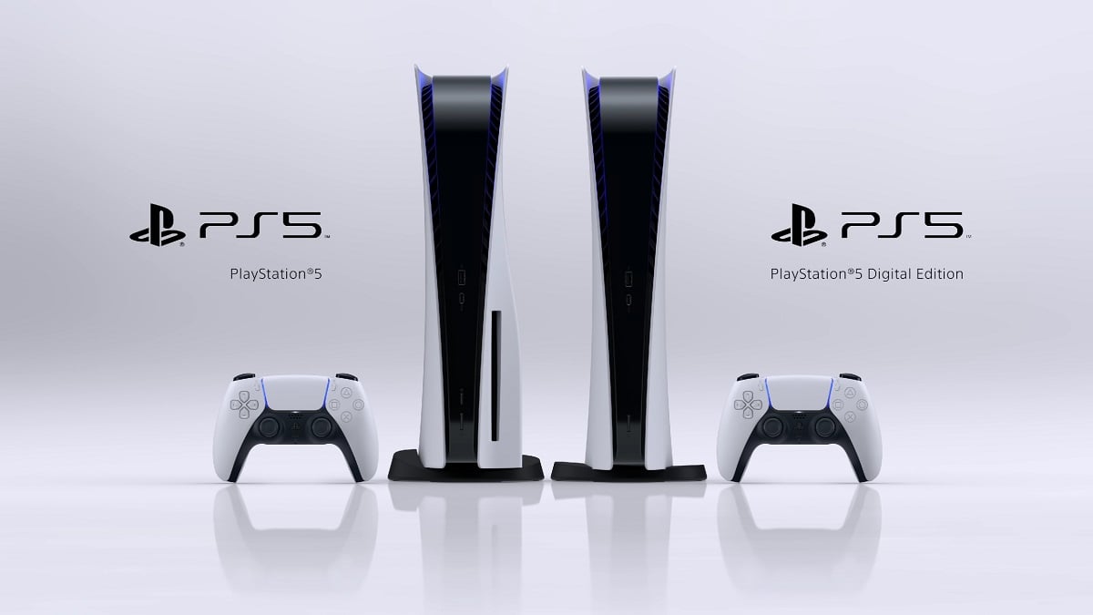
Such a prominent game being released with these limited options also makes Microsoft look bad when compared to Sony, whose recent hits The Last of Us Part 1 and God of War: Ragnarok came with a huge suite of accessibility options opening up the game to practically everyone who wants to try it.
A brighter future?

The only silver lining is that we believe things will get better. For example, Halo Infinite had features like menu narration, in-game text-to-speech, and options to alter friendly and enemy colors added post-launch. We’re fairly confident Starfield will get some improvements soon, and even if Microsoft and Bethesda Softworks don’t add them, modders may take up the slack.
Even so, the experience of Starfield in its launch window is something many players will not be able to participate in through no fault of their own. Perhaps we’d cut the game a little more slack if Microsoft hadn’t spoken so highly of their efforts to improve accessibility, but as it stands Starfield‘s undercuts a lot of that messaging. As Saylor concludes:
“Right now the rest of the gaming community gets to fly off into spaceships while disabled gamers are left back on Earth, hoping that one day they’ll reach the stars.”
Here’s hoping for an accessibility patch as soon as possible.





Published: Sep 1, 2023 05:50 am