The MCU is often a world of excess, which makes sense given its star power, massive budgets, and big storylines. While this worked perfectly for ensemble movies like the Avengers and Guardians of the Galaxy, fans and producers alike are quickly learning that perhaps not everything needs to be a million miles an hour, even if it sometimes feels that way.
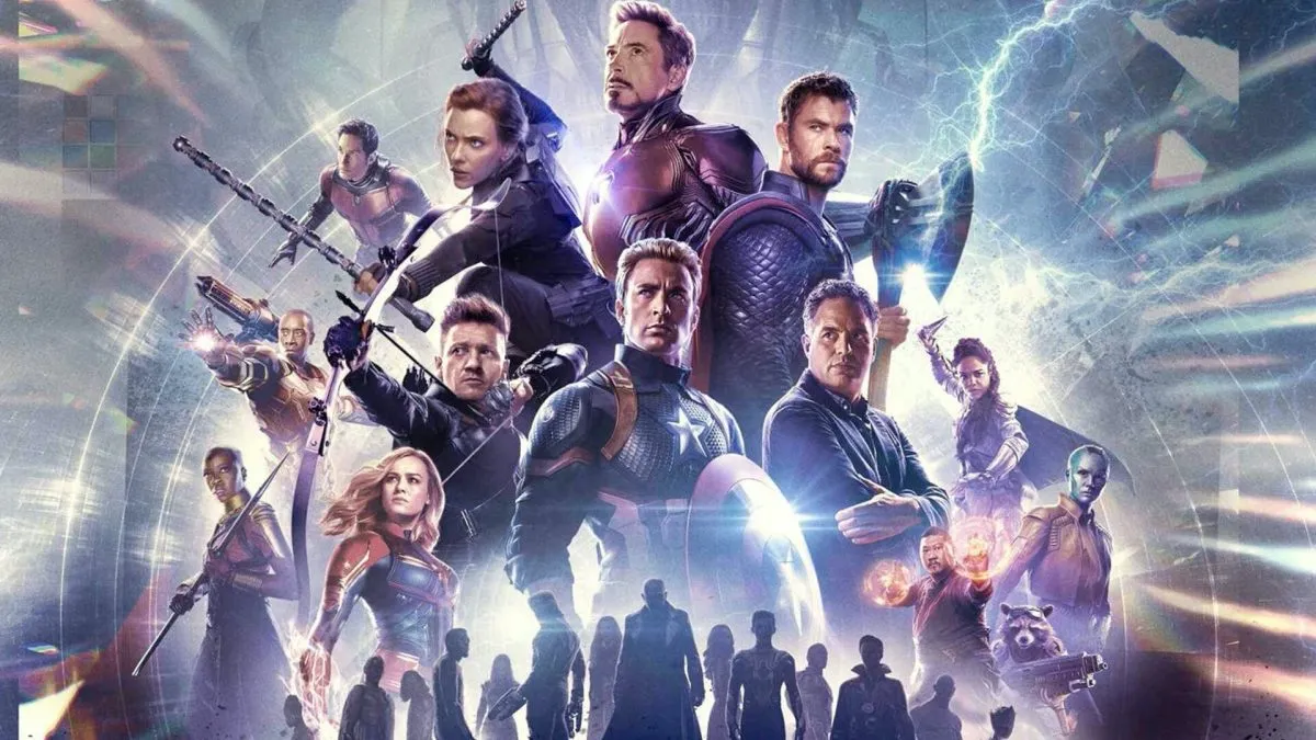
The most obvious example of this truism is the lukewarm reaction to Phase 4 of the MCU, which saw writers and directors dive headfirst into the idea of a multiverse, even when it sometimes led to plot holes and other issues. However, this need to go big or go home can also be seen in many other aspects of how the franchise is doing things, including its posters.
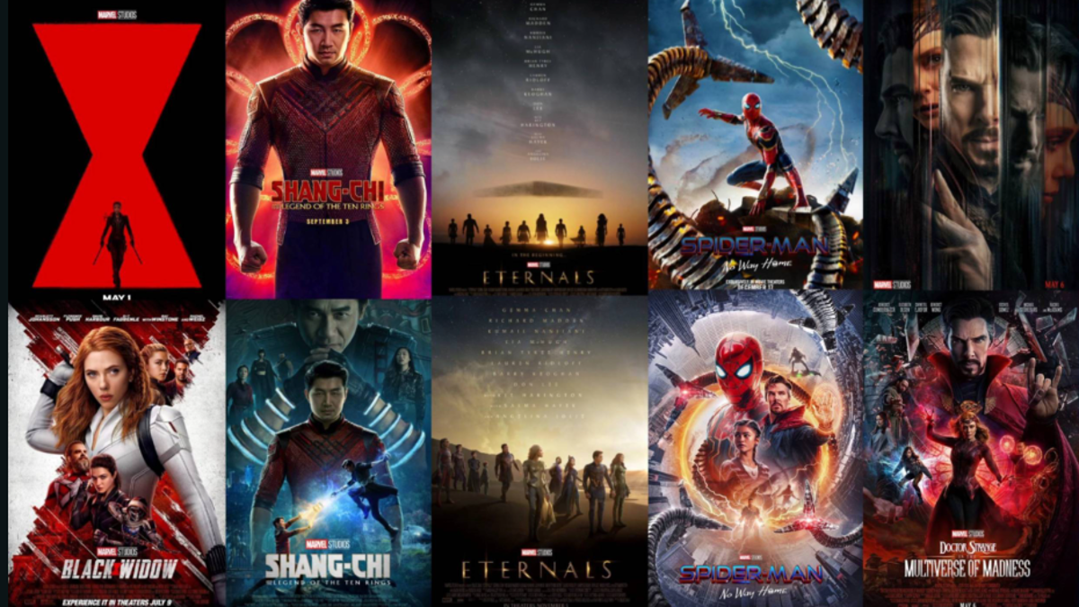
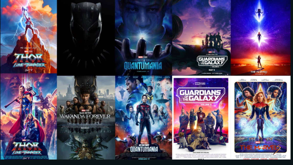
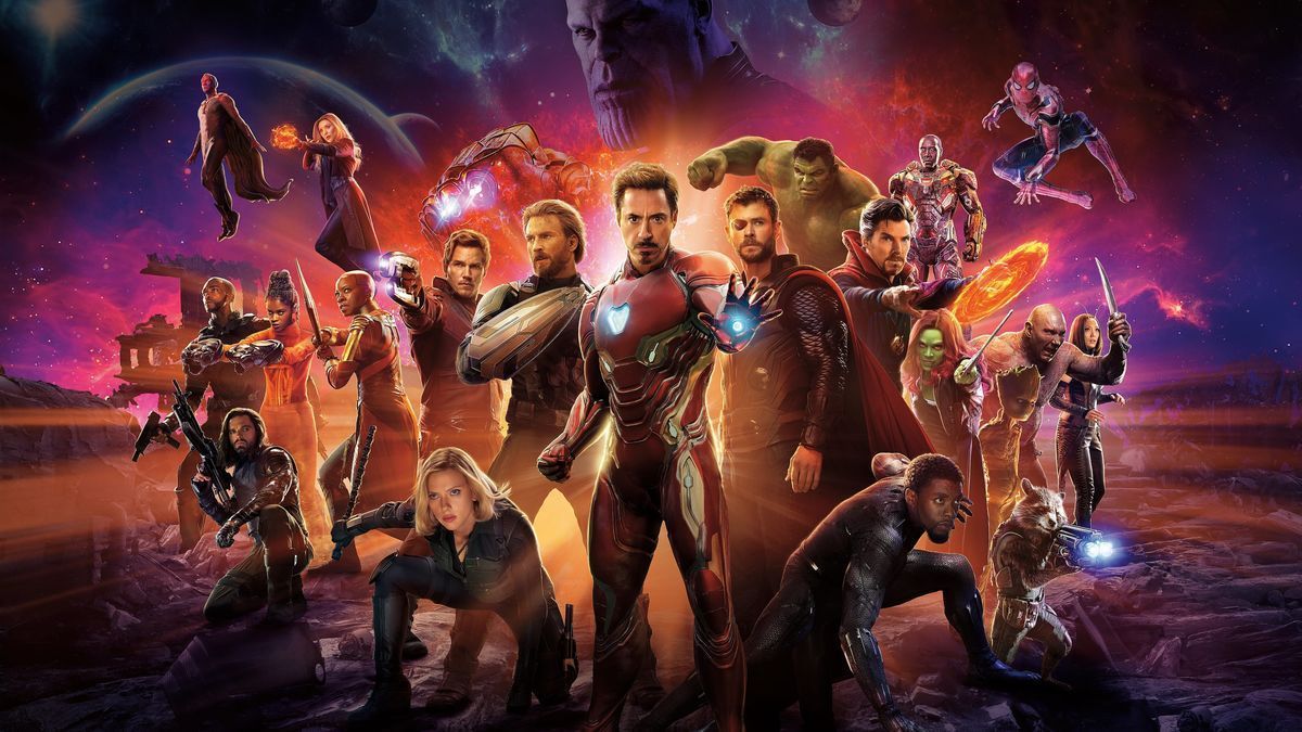
A recent post on the Marvel Studios subreddit compared teaser posters to the real thing for many of Phase 4 and Phase 5’s biggest releases, and the general consensus among the fandom was that the teasers were generally much better thanks to their comparative minimalism. Black Widow was especially singled out for its brilliant original marketing material, which was just intriguing enough to keep viewers wanting more, while also being a beautiful bit of graphic design.
While it’s easy to lay the blame for this at the feet of Marvel, redditors were quick to point out that there are probably other factors involved, namely commercial and contractual needs to get actors’ faces front and center of promotional material. There’s also the fact that the franchise knows exactly how to make the most money from its audience, so the data and research probably show that busier posters with famous faces on them drive ticket sales much more than artistically interesting but more minimal designs.
Now, whether or not this is even worth discussing is another matter. As shown by the poor performance of Secret Invasion, Marvel has plenty of issues to dig into and try and rectify over the coming months and years that are way deeper than arguments around posters.
With that said, taking care of the little things can often lead to massive improvements on a larger scale, so there is that to take into account. However, given the roster of stars that need to have their faces shown on main posters, and the fact that Marvel keeps raking in the cash despite a perceived lower quality of product, we’re not sure we’ll see changes any time soon.

Published: Aug 18, 2023 07:11 am