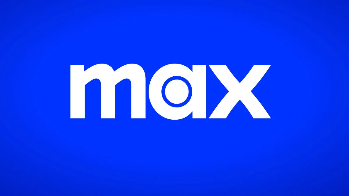
Today, HBO Max officially becomes Max, as part of a rebranding decision contested by many. One would think the name change is the most upsetting outcome of this ordeal, however, subscribers have more to complain about.
Besides the name change, the streaming service is also rebranding its color scheme, doing away with the purple gradient we have all gotten so used to and replacing it with solid blue. The purple color has been an essential part of HBO Max’s brand up until now, and because change rarely comes easily to people, it’s not difficult to see why many are resistant to this swap.
On Twitter, many subscribers have taken to openly mourning this particular change, claiming that the previous purple design was much nicer to look at. The complaints started yesterday, before the transition even took place, and have only gotten louder today, as people take a look at the new app.
In all honesty, users aren’t wrong. Blue isn’t exactly an exciting color, especially the particular shade of blue Max is going for, and as anyone with a bit of knowledge in marketing can tell you, the color or overall look of a product — in this case, a streaming platform — has an influence over consumers’ choices.
With this change, Max joins a growing list of streaming services with blue as its primary brand color. To some folks, this only makes matters worse, as this platform not only looked better in purple, but it also stood out from others a bit more.
This is only one of the changes heading our way with Max, but it’s certainly among the ones causing the most controversy online. Will this rebrand dictate the beginning of the end for Max? Time will tell. But so far, things aren’t looking great.
