Domino’s Pizza is getting its first brand makeover in over a decade, but people actually love it. This isn’t one of those corporate, bland, and utterly pointless aesthetic changes we’ve seen so many times recently. Instead, the popular pizza franchise is embracing a bold, nostalgic ’80s and ’90s style that feels like a breath of fresh air. The change is simple but impactful, and it’s got the whole internet talking about how it’s time for the boring, minimalist trend to finally die.
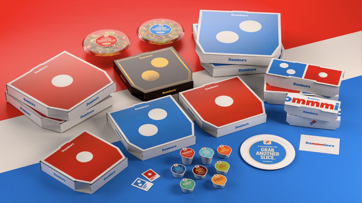
The rebrand is actually a few different things working together. You can expect a brand-new font, Domino’s Sans, and a shift to packaging that is much simpler, brighter, and, frankly, bolder. They’re not doing a full overhaul, though; they made sure to keep the familiar red and blue as the primary colors.
Domino’s Chief Marketing Officer, Kate Trumbull, told AdWeek that keeping the core identity was “imperative,” saying, “It’s about enhancing what makes us great versus change for the sake of change.” That’s a good strategy, and it’s clearly working for this top pizza chain.
Dominos looks good again
I think the most clever part of the new visual identity has to be the pizza boxes themselves. The design makes it look like a pair of domino game pieces when two boxes are placed next to each other. The bold colors and imagery call back to the classic pizza franchise aesthetic without feeling dated; they feel fun and intentional. An X user perfectly summed up the reaction by asking, “Wait. What’s this? A brand redesign that actually goes hard in the big ’25?”
Along with the visual change, the company is introducing a new audio element: a jingle from the musician Shaboozey and a trademarked pronunciation, “Dommmino’s.” Yeah, the extra “mmm” is a little goofy, to be fair, but their rationale makes sense; they point out that “you literally can’t say Domino’s without saying ‘mmm.’” It’s all part of the strategy to dominate the social landscape.
As Trumbull explained to CNN, it used to be that running a 30-second ad in primetime was all you needed. Now, “you need to catch attention in a second or two on TikTok or an Instagram Reel or YouTube, and when you have a jingle, you can get that instantly.” You can’t argue with that kind of logic in today’s fast-paced digital world.
A lot of companies have tried to rebrand in recent years, and most of them have flopped. Sometimes it’s for ridiculous reasons, but often they fail because the new look is just… boring. They strip all the character out in a desperate attempt to be “clean” and “modern,” and the result is always a muted, soulless mess. That’s why I’m so enthusiastic about the direction Domino’s is taking. It still has character.
While the design is getting all the love, it’s important to remember what really matters. For the most part, users are just happy that the recipe hasn’t changed from the last major update a few years back. The new look is fantastic, but we’re all here for the food.
This is an excellent brand refresh; it’s clean, high integrity, and totally transportable across every medium, whether it’s an Instagram Reel or a physical box. It proves you don’t have to sacrifice all your personality to get attention in a world dominated by simple white logos.


Published: Oct 9, 2025 08:50 pm