Minnesota: The “Land of 10,000 Lakes.” Home to more Minnesotans than any other state in the continental U.S. State fish: The walleye. State muffin: Blueberry. State flag: Different than it was.
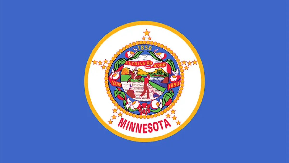
Yes, in 2023, the great state of Minnesota – state tree: Norway pine, state bird: The common loon – elected to change its official flag, following decades – more than a century, even – of people complaining that their old state flag sucked. To be fair, it did. This is what it looked like:

Look at that thing. Putting aside the fact that having guys in the foreground and background is, at least by flag standards, super hat-on-a-hat, it also boasts a smattering of racist imagery and, inarguably, is boring. Like, crazy boring. It looks like half a dozen other state flags, only less exciting. Sure, the 19 stars representing the the territory’s singular place as the 19th state in the Union (not counting the first 13) are nice and all, and the “L’Étoile du Nord” motto adds a sense of European regality, but the sum of its parts is nothing to write home about. It’s a display of the sort of effort you’d expect from the state flag of, say, North Dakota, or Missouri, but Minnesota? The home of Richard Dean Anderson, Steve Zahn, and The Trashmen? No. Minnesota deserves more than just the Nebraska state flag with different stuff in the middle.
Minnesota gets what it deserves: A different flag
And now, they have it. After an exhaustive election process, Minnesotans will now be represented not by a field of blue with some guys in the center, but by two fields of different shades of blue with a star on the side. Here, we’ll show you:

There it is: The new state flag of Minnesota – state mushroom: The common morel, state flower: The pink-and-white lady’s slipper – as chosen by the State Emblems Redesign Commission from over 2,500 entries. The hip, fresh new face of the state was based on a design submitted by Luverne resident Andrew Prekker. From here, it’s a waiting game. The design will become official beginning on May 11, 2024, but only if the State Legislature doesn’t shoot it down first. You never know what that rascally Minnesota State Legislature is going to get up to. They’re an impish and mercurial lot.
This marks the third revision to the Minnesota state flag since the original was introduced in 1893. In 1956, the original’ garish white lady’s slipper flowers were replaced by elegant pink-and-white lady’s slippers, and its color profile was shifted to a uniform royal blue. In 1983, realizing their mistake, the state changed the royal blue aspects to a flirty, fun medium blue.








Published: Dec 20, 2023 06:09 pm