Pokémon designs are usually well-thought-out, as oftentimes they’re inspired based on the region they’re in or the environments in which they’re located. But not all Pokémon are conceived equally, as some are either underwhelming or lazy at most. And while fans have poked fun at how uninspired many latter Pokémon designs have been, it’s only a handful where that’s the case.
But it’s fair if a few designs are low-tier to fans, as over 900 Pokémon have been introduced to the franchise to date. That is a lot of different creatures with different backstories and design choices made by developers. Out of all the Pokémon that currently exist, here are at least 10 of them that should have gone back to the drawing board.
10. Luvdisc
According to some fans on Reddit, Luvdisc looks pathetic. The Pokémon is very small and doesn’t have many benefits other than holding heart scales. It doesn’t even evolve into something tougher. While Pokémon can give it a cool underdog story in the anime, it still does look pretty weak. It’s also rather useless in battle, having laughably low attack and a merely acceptable speed stat.
9. Enamorus
Enamorus is a new Pokémon introduced in Pokémon Legends: Arceus as an additional member of the Forces of Nature. But unlike the other members that are named after weather events, Enamorus seems to be the odd one out. It doesn’t look intimidating, and even its backstory is different from the others. The original trio are representations of varying weather patterns, while Enamorus is meant to symbolize springtime. If you disrespect the Pokémon, it will attack. While it is understandable that this Pokémon is meant to look feminine, its addition to the Forces of Nature group is underwhelming at most.
8. The Vanillite line
The Vanillite line has to be one of the most lazily-designed Pokémon evolution lines out there. Living garbage? Sure. Possessed teapots? Why not. But this is just a floating ice cream cone, even when it evolves. Either Game Freak struggled to make living icicles or just pulled off a Monsters Inc. reference but changed snow cones to ice cream. Just because you give a Pokémon powerful moves or a scary backstory doesn’t mean it’s intimidating. Even in the anime, Team Rocket puts Vanillite in a cooler, playing on the idea that it’s just a sentient ice cream cone.
7. Morpeko
Whenever a game tries to make a pika-clone (which is often), it must stand out and not look exactly like Pikachu (unless you’re Mimikyu). But Morpeko is literally a close imitation of Pikachu. If it didn’t have the brown and black stripes, it would be an almost exact copy of the original yellow mouse Pokémon. What made this Pokémon stand out is its “Hangry mode” when its entire body turns dark. I’d like to believe that this Pokémon is an alternate version of chubby Pikachu because, dang, this Pokémon likes to eat a lot.
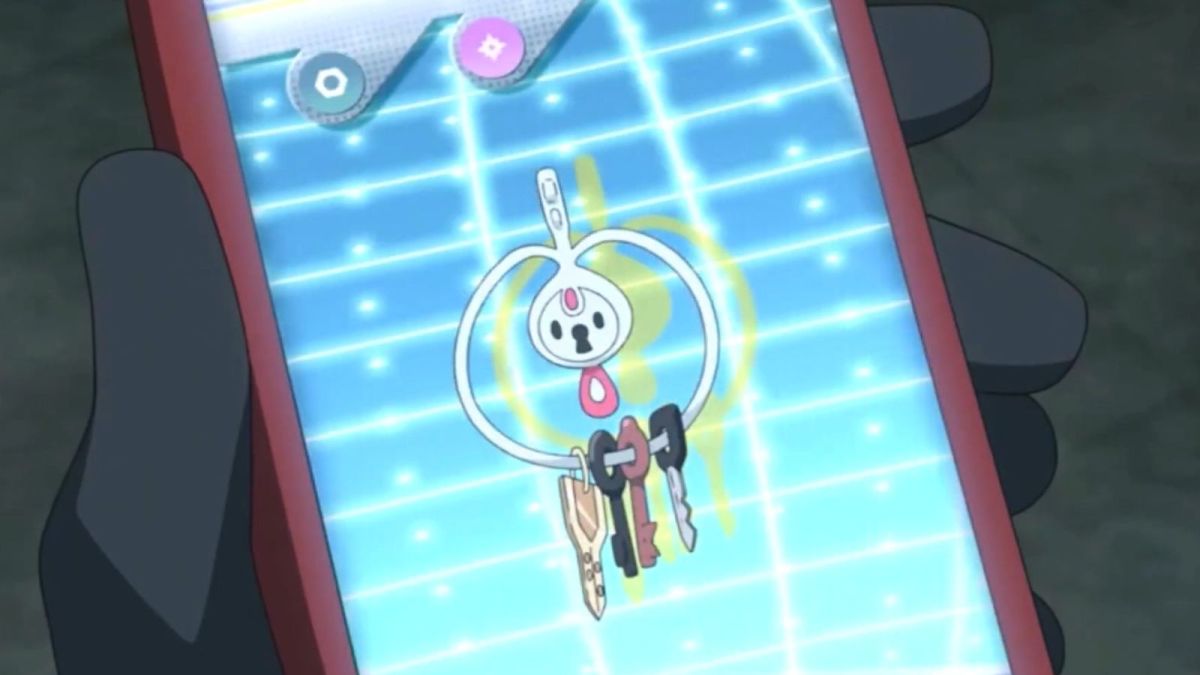
6. Klefki
Klefki is just a floating keychain that likes to steal or collect keys. That’s it. That’s the gimmick. Even its backstory is odd because it used to be something else in the past but eventually turned into what it is today due to metal scarcity. But even with its interesting backstory, the Pokédex entries for Klefki point out its love for metallic door openers. If you catch this Pokémon, you don’t need to use a normal keychain anymore, use your Pokémon instead.
5. The Yungoos line
The Yungoos line was mocked heavily by Pokémon fans when Pokémon Sun and Moon first came out. Its appearance resembles a certain (former) political leader, and fans were not hesitant to point that out during the early days. Also, it’s an early-game Pokémon that doesn’t have that cuteness appeal to it. You’ll probably just catch it for the sake of completing the Pokédex and swap it for something better later on.
4. Phione
Phione is odd, as it only exists if the legendary Pokémon Manaphy breeds with a Ditto. It doesn’t evolve into Manaphy or vice-versa, and there are still debates whether or not Phione is a mythical Pokémon due to clashing information from official material. Phione raises a lot of questions for those wanting to know more about the sea guardian and will probably remain unsolved for now.
3. Stakataka
Ultra Beasts were meant to be extradimensional Pokémon that found outside traditional regions. But out of all the Ultra Beasts, Stakataka seems to be the odd one out. Unlike the other Ultra Beasts that have an extra-terrestrial-like appearance, Stakataka is literally a moving structure. At first glance, you’d think it is like an evolved form of Stonjourner or an Alolan variant of Crustle. But instead, this sentient structure looks grossly out of place compared to the others.
2. Coalossal
Raise of hands, who saw this Pokémon and immediately thought ‘oh, it’s the Galarian variant of Rhyperior’?. At its core, Coalossal houses a coal furnace, but besides the novel backstory, the designers made it far too similar to a Gen III favorite. Only the embers at the top help make help to make it stand apart from Rhydon’s evolution. It would have made more sense to just call it a Galarian Rhyperior.
1. Regieleki
Out of all the Pokémon in the Regi Quintet, Regieleki has to be the most underwhelming. It looks like an electric fly rather than a creature of power, which is sad because it’s located in the same place as Regidrago. Both are small, yet powerful, but for some reason, Regidrago looks more intimidating than the electric type. While the franchise tried to justify it by saying that the rings on its body help restrain its full potential, the bundle of energy still lacks a threatening appearance.
It’s ok if you don’t like a Pokémon’s design. Maybe it doesn’t appeal to you, or maybe you’re just confused as to why that’s how the Pokémon looks. But like everything else, the way a Pokémon appears is subjective to fans, as each of them has their own definition of what is ‘bad design’. Hopefully, in Pokémon Scarlet and Violet, there would be at least some well-throughout Pokémon with unique design choices not made out on a whim for no reason.


Published: Jul 1, 2022 08:22 am